Role
Sr. UX Designer
In-Scope
Support App Icon
Timeline
3 Weeks
Status
Live
A small visual surface. A massive impact. And one of the coolest projects I’ve ever had the chance to shape at Apple.
Objective. How might we bring the Support App icon in parity with iOS26?


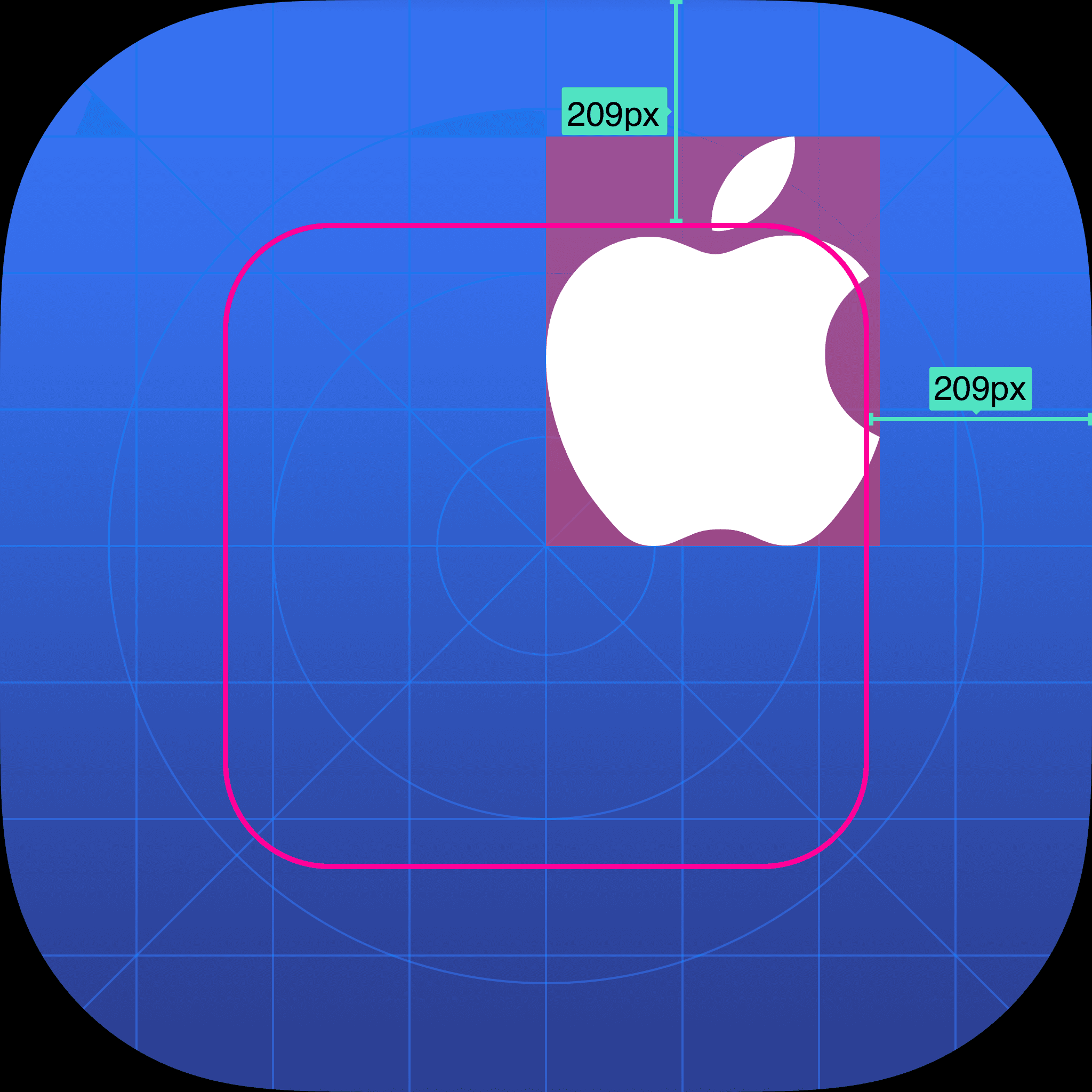
New Grid for iOS26. Observed the updated app icons to understand how they adhere to the new grid, placement and size of the key elements of the app icon.


Realized. Health App icon features a large top-right logo, noticeably larger than the Apple logo in the Support App icon. Most icons follow a central alignment and adhere to the icon grid.
Design Exploration. It was essential to have the right size, placement and alignment of the Apple logo within the App icon. Tried a few technical approaches to design the Support App logo that fits well within the new iOS26 grid.
I tried aligning the Apple logo along a diagonal axis to match the App Icon’s natural flow.
While this was technically balanced, it ended up visually unbalanced. The leaf and bite still pulled the weight upward and left and the outer radius looked off. The composition needed more adjustments to feel stable and intentional.

Concentric Grid
I experimented with a concentric grid, using radii to guide the Apple logo’s curves. By aligning the logo’s key points to these circles, I aimed to create a sense of visual balance.
While it didn’t fix everything perfectly, the concentric approach helped the symbol feel more harmonious and naturally grounded.

But. I realized that Apple logo is not as simple as it looks. And it needed to be visually balanced and aligned rather than having a technical solution for it.
Final Construct
Taking the second approach as the guiding factor, I nudged the Apple logo a few pixels up and a few pixels right. This subtle shift finally balanced the visual weight, making the symbol feel stable, centered, and harmonious.
The Cool Part? I had a chance to present and defend my design decisions directly with leadership at Apple and that experience was one for the books. 😎
Onto the next. Now that everyone was on board with the alignment and placement of Apple logo within the app icon, it was time to add the Liquid Glass Effect.
Liquid Glass Effect. A layered app icon comes together to produce a sense of depth and vitality. Here are some key observations of app icons iOS26.
Most App Icons have a gradient as background


White icon subjects often adapt to background color in Dark Mode.


Apple’s Corp guidelines recommend keeping the Apple logo white regardless of its background.

Design Exploration. Based on the observations, I started exploring the liquid glass effect for Support App Icon in the Icon Composer.

On-Device Testing. Played around with different configurations of opacity, gradient, translucency, shadow settings and tested it on-device (iPad mini) to take the final decision.

Appearances. iOS26 comes with Default, Dark, Clear and Tinted appearances. The user can choose the appearance for app icons on the Home Screen irrespective of their chosen appearance mode in System Settings.


Note. Referred to Human Interface Guidelines as the ultimate source of truth.