Acciojob Website Revamp
Acciojob | Freelance
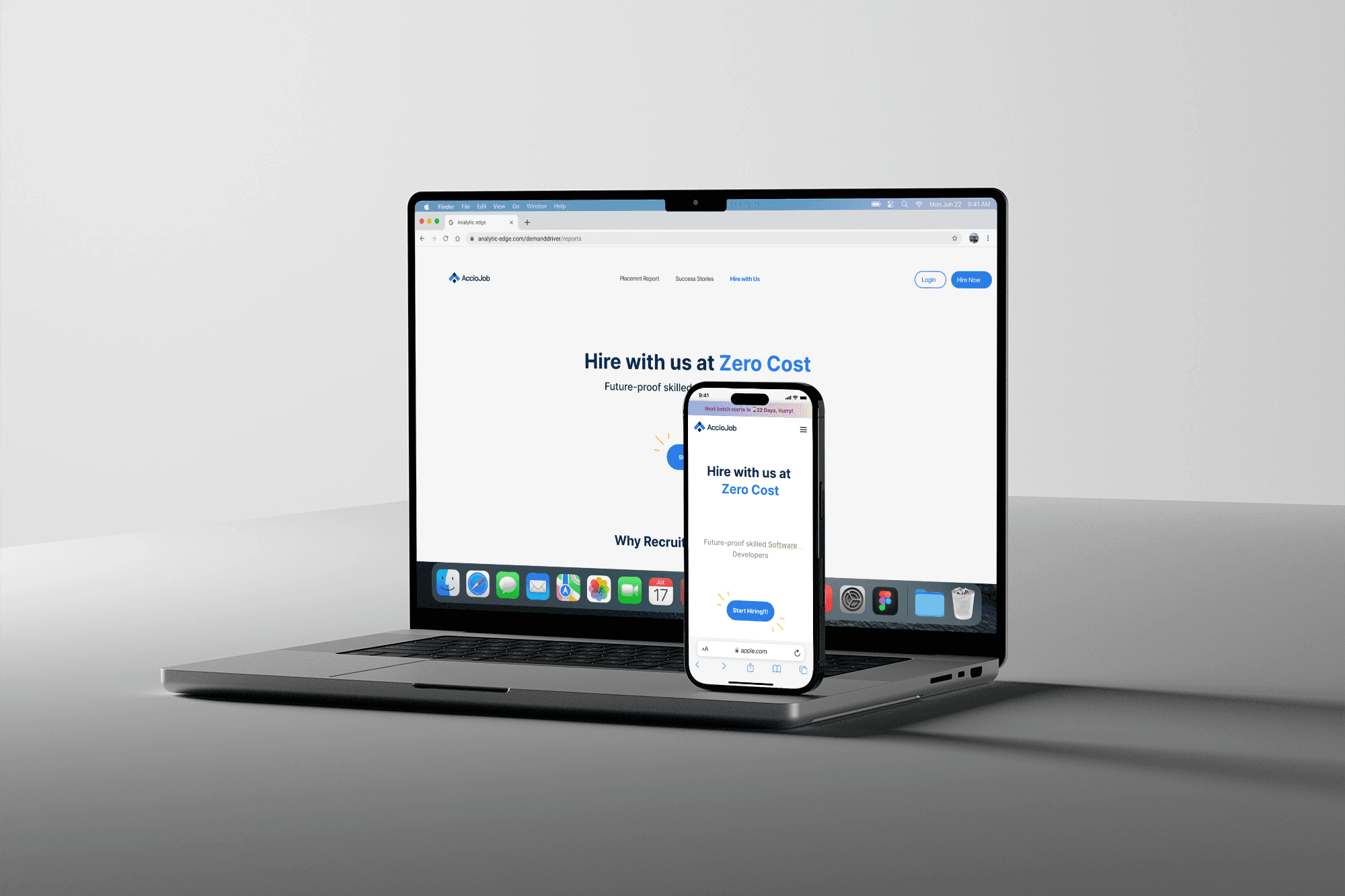
Acciojob Website Revamp
Acciojob | Freelance

Acciojob Website Revamp
Acciojob | Freelance

Background
Industry
Ed-Tech | Website Redesign
Role
Product Designer
Timeline
06 Months
Acciojob is an ed-tech platform that offers a 6-month full stack web development training programme. Starting 2022 the company was expanding and they needed a stronger brand identity. That’s when they decided to rebrand themselves. I happened to have come in contact with them at the right time and helped them through the process of their website facelift.
To Begin With
Understanding the existing brand
Working for Acciojob was a fun and fulfilling experience for me. It started with us understanding Acciojob as a company, their clients, their vision, etc. For focusing on usability we conducted heuristic analysis and aligned the new design with predefined design principles. Then we justified what needed to be changed and the reason behind the same, in order to make the brand image congruent with their ideology.
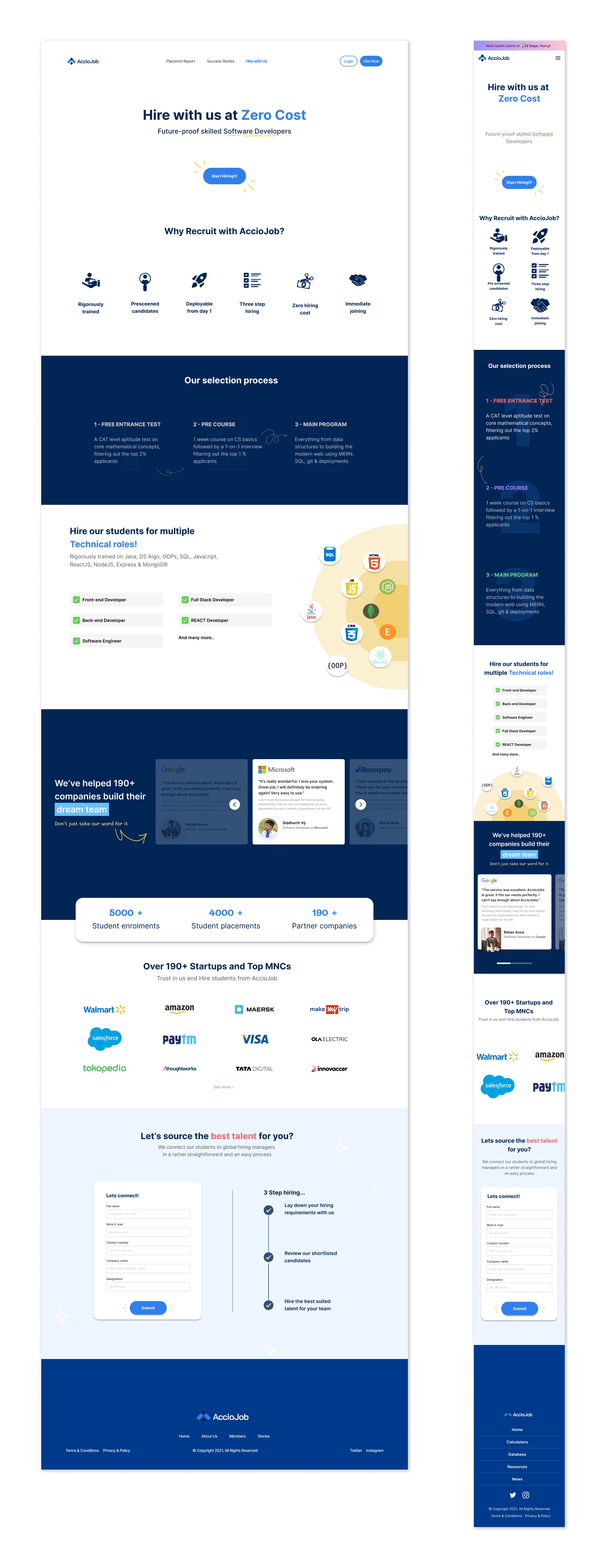
Let me take you through the journey of HIRE WITH US page that aims at easing B2B services and relations.
Heuristic Analysis
These are some of the observations we made for the existing HIRE WITH US page:
The user flow was inefficient.
The colour scheme failed to create a positive vibe
There was excessive wasted space
The information collection form lacked engagement
Insufficient information was provided
The text hierarchy was unclear
The interface was not interactive
Design
For the hire with us section, we changed the structure of content from what it was earlier to make it more relatable for the users. We ensured that the navigation was intuitive and the layout was responsive, providing a seamless user experience across devices.
We used modern typography and colours to to give the site a professional yet welcoming feel.
We used micro animations and interactions.


Micro Interactions
Micro interactions are essential for creating an interface that feels responsive and intuitive. When carefully crafted, they elevate the user experience, making it more engaging and fluid.
Here, we’ve implemented on-hover micro animations that change colour when hovered over.
Micro Interactions
Micro interactions are essential for creating an interface that feels responsive and intuitive. When carefully crafted, they elevate the user experience, making it more engaging and fluid.
Here, we’ve implemented on-hover micro animations that change colour when hovered over.
Micro Interactions
Micro interactions are essential for creating an interface that feels responsive and intuitive. When carefully crafted, they elevate the user experience, making it more engaging and fluid.
Here, we’ve implemented on-hover micro animations that change colour when hovered over.
Insights
It is essential for a company's website to clearly convey its purpose, goals, and operations.
A website should always be interactive to engage users effectively.
Forms should collect only the necessary information to minimize user drop-off rates.
Insights
It is essential for a company's website to clearly convey its purpose, goals, and operations.
A website should always be interactive to engage users effectively.
Forms should collect only the necessary information to minimize user drop-off rates.
Insights
It is essential for a company's website to clearly convey its purpose, goals, and operations.
A website should always be interactive to engage users effectively.
Forms should collect only the necessary information to minimize user drop-off rates.